[ 07 · Mallet studio · 2023 ]
MUS.E Firenze
One site for Florence's thirteen civic museums and their tours.
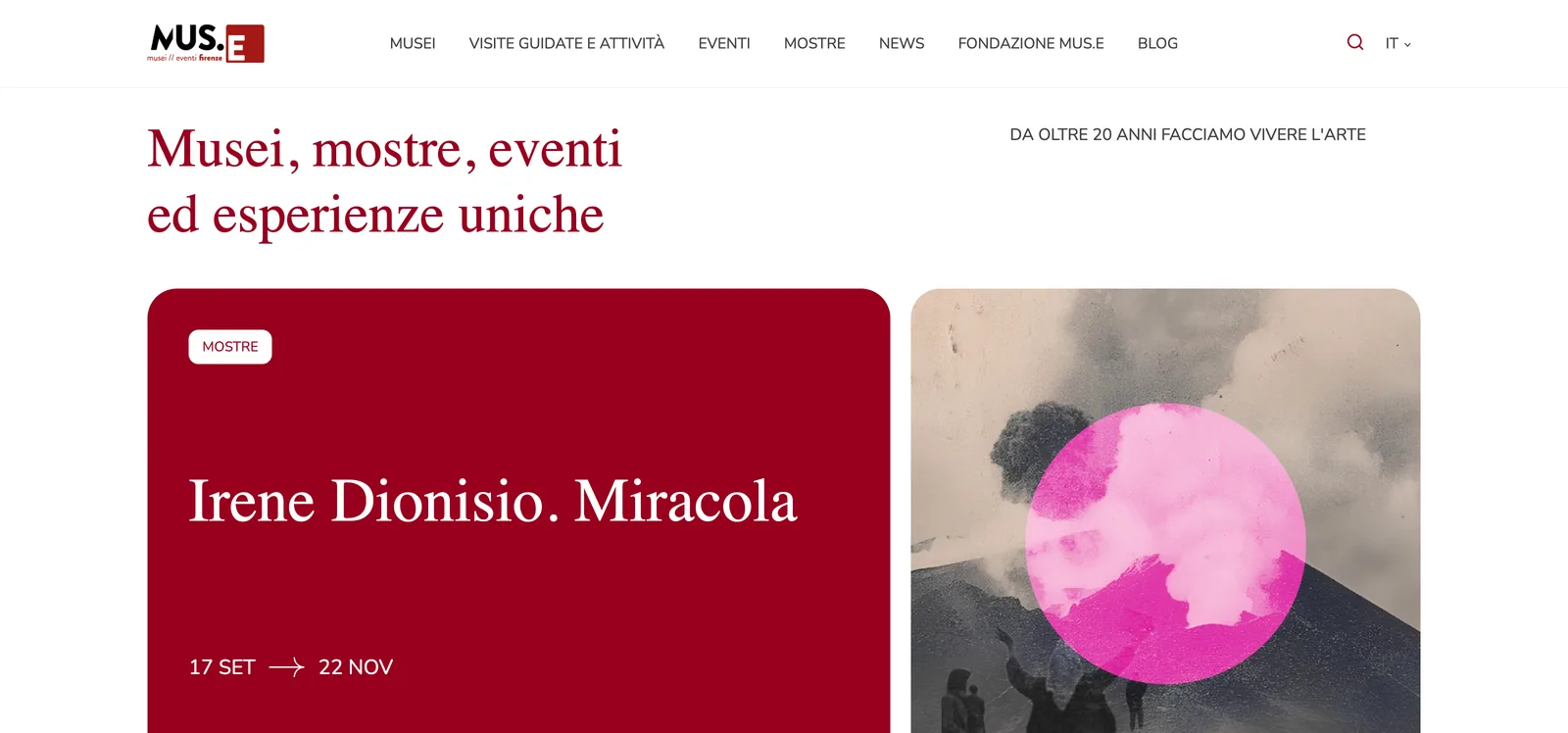
MUS.E runs Florence's civic museums — Palazzo Vecchio, Museo Novecento, Palazzo Medici Riccardi and ten more. UX/UI design at Mallet studio, in 2023, for the site that has to hold all of them, plus the tours, the school programmes and the exhibitions.
- Role
- UX / UI Design
- Year
- 2023
- Tags
- Web · Culture
- Links
- musefirenze.it ↗
[ 01 · Context ]
Fondazione MUS.E has looked after the Musei Civici Fiorentini for more than twenty years. Thirteen museums, not all of them in Florence: the Leonardo museum is in Vinci. On top of that sit guided tours, workshops for schools, exhibitions and events. A tourist checking Sunday hours, a Florentine parent looking for something a seven-year-old will sit through, and a teacher booking a class all land on the same domain.
[ 02 · Role ]
UX/UI design at Mallet studio, 2023. I designed the interface in a team of two, with a senior developer. Mallet closed after the project and Alias2k, credited in the footer, carried the site on.
A straightforward interface project: no research programme, no analytics to quote. What follows is the interface and the decisions visible in it.
[ 03 · Problem ]
Thirteen museums means thirteen ticket tables, thirteen sets of opening hours and thirteen reputations, from Palazzo Vecchio down to a cycling museum. On top of them sits a catalogue of paid tours and workshops that belongs to the foundation, not to any one building. Lead with the museums and the tours disappear. Lead with the tours and the museums stop being findable.
[ 04 · Decisions ]
- 01
Thirteen museums under one shell
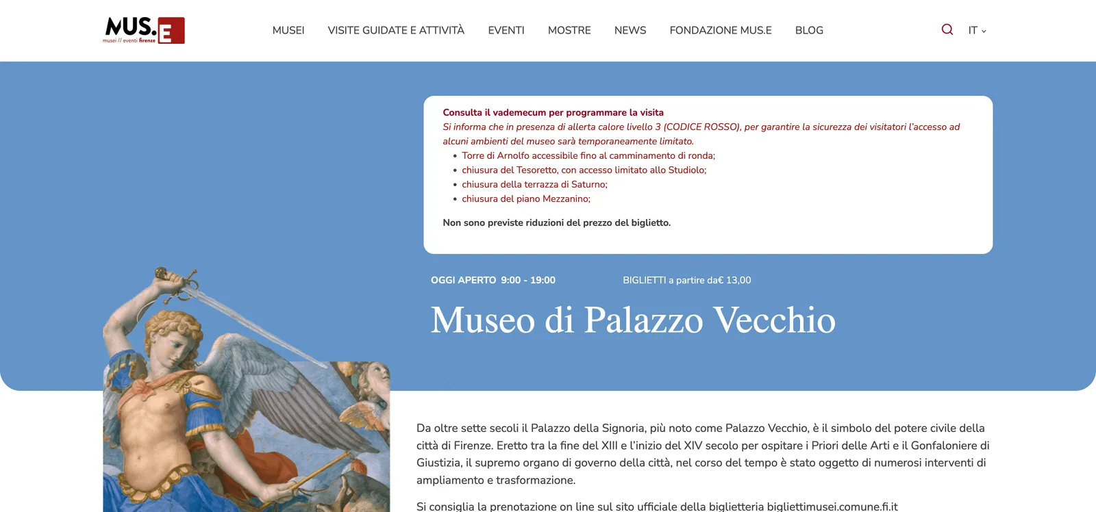
One Musei entry in the nav; every museum sits inside the MUS.E frame, keeping its own accent colour but the same header, hours block and ticket table. Palazzo Vecchio gives up the standalone site a monument that size could carry. In exchange, someone who arrives for a tour finds the other twelve, and the foundation maintains one template.
- 02
Tours sorted by audience, not by collection
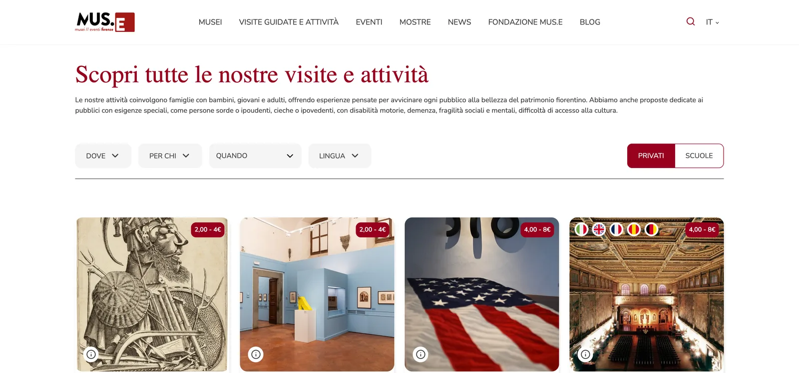
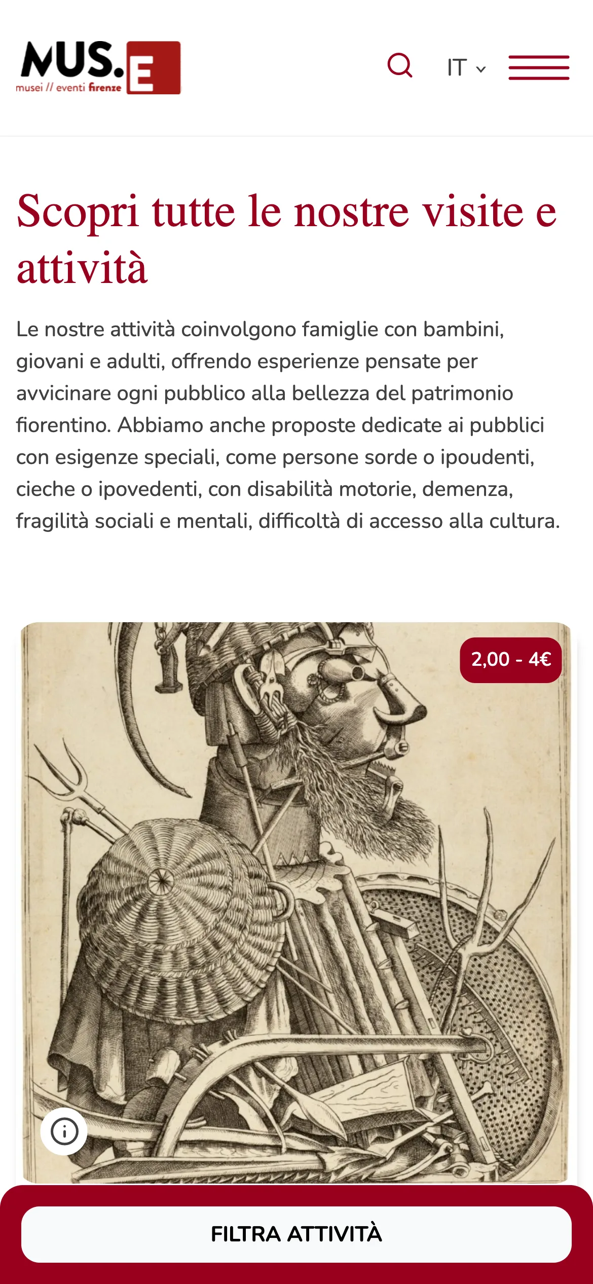
Visite guidate e attività opens on a Privati / Scuole switch, then filters by Per chi: families with children, young people and adults, special publics. Where, when and language come after. Sorting by museum would have matched how curators think about their own rooms. This asks them to tag every activity by audience instead, so a parent can skip the palace and ask whether a seven-year-old lasts an hour.
- 03
Tour language as a filter, not a translation
The interface runs in three languages: Italian, English, French. The language a tour is actually delivered in is a separate filter with five, printed as flags on the card before anyone opens it. Two language systems in one product means more to explain to whoever loads the content. Translating the whole site five ways would have cost more and still not told a German visitor which slot he can follow.
[ 05 · Outcome ]
There are no launch numbers, and there were none to have. What I can check is the site running today: thirteen museum pages on one template, a tour catalogue filtered four ways with the price on the card, and a museum page that answers open now and from how much above the history. Whether every part is still the design that shipped in 2023, I have not verified.
[ 06 · Credits ]
- Federico Vietti — UX / UI Design, Mallet studio, 2023 (team of two with a senior developer)
- Client: Fondazione MUS.E, for the Musei Civici Fiorentini
- Live site footer, verbatim: "Designed & developed by Alias2k" — Mallet studio closed after the project and Alias2k took the site on
[ Contact ]
Let’s talk
Open to product design roles, and to good collaborations.