[ 06 · Gradeon · 2026 ]
Know Your Card
One continuous shot explains card grading in 76 seconds.
The explainer film for Gradeon: one continuous shot in real perspective, from a card arriving out of the dark to Gradeon’s read of it. It opens Know Your Card, a series of short episodes that is still running.
- Role
- Motion design · Content
- Year
- 2026
- Tags
- Video · Motion · Ongoing
[ 01 · Context ]
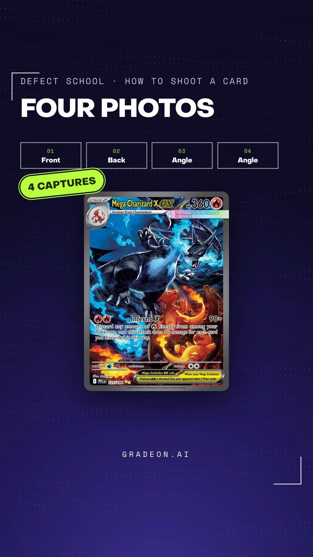
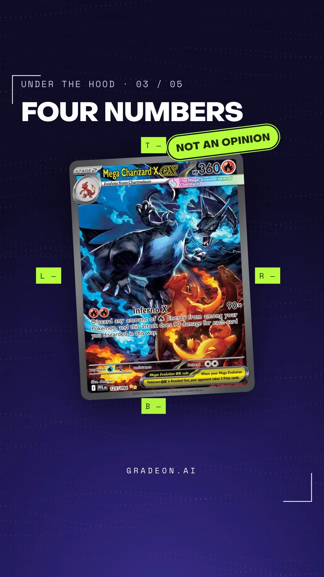
Gradeon grades trading cards from phone photos. Most collectors have never watched a grader work, so the film shows the job before it shows the app: a card arrives out of depth, multiplies into a wall of unknowns, gets measured, priced and stamped with a fee, then turns over to show what Gradeon reads on it.
Around it sits Know Your Card: short narrated episodes on defects, centering and price, airing from September into November 2026. The series is ongoing, so this study is about the film.
[ 02 · Role ]
Motion design and content. I wrote and built the explainer, in 16:9 for the site and YouTube and 9:16 for Reels, TikTok and Shorts, and designed the frame system the episodes inherit: one lime accent, PP Object Sans headlines, Space Mono labels, burned-in captions.
The films are HTML compositions rendered with HyperFrames; narration and captions come from the same script.
[ 03 · Problem ]
Grading is invisible. The card goes into an envelope and a number comes back weeks later. The film has to make the four things a grader looks at visible in about a minute, without a talking head and without a screen recording of the app.
It also has to survive two formats. A 16:9 shot composed for a landing page loses its edges on a phone, and the platform covers the top, the bottom and the right of a vertical frame with its own controls.
[ 04 · Decisions ]
- 01
One continuous shot, not a montage
A single move through real perspective, no cuts: the card comes out of depth, multiplies, gets measured, gets priced, turns over. A montage would have been faster to make and easier to re-edit. The continuous shot costs a rebuild whenever the story changes; it buys the sense that grading is one process, not a list of features.
- 02
Two ratios from one scene, re-framed not cropped
The 9:16 version is laid out again from the same scene, with headlines and callouts kept inside the safe area. That is two layouts instead of one export, and smaller type on the phone. A crop is cheaper. It also puts the headline under the caption bar.
- 03
No music
Narration and captions carry it, with a few stingers from the brand sound pack. Music would have made the cut feel finished sooner. Without it, the pacing has to come from the shot and the voice, and the film plays the same with the sound off, which is how most people will meet it.
[ 05 · Outcome ]
The explainer shipped in both ratios on 13 September 2026 and runs 76 seconds. The series it opens is still airing, fifteen episodes scheduled from September to November 2026, so there are no performance numbers here yet.
[ 06 · Credits ]
- Federico Vietti — writing, motion design, build
- HyperFrames · PP Object Sans · Space Mono · edge-tts narration
- Card art from Gradeon’s own catalogue
- For Gradeon, 2026
[ Contact ]
Let’s talk
Open to product design roles, and to good collaborations.